Sunday, April 29, 2012

Self Chosen Post #3- Product Design


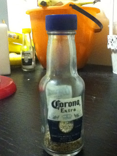
Dieter Rams would despise the design of my pepper shaker. It is a standard pepper shaker, nothing too fancy- which is fine. However, it does not work as promised, and deliver pepper properly upon shaking it. It gives out scarce amount of pepper and requires very rigourus shaking for this to happen. I decided to list Deter Rams' 10 principles of good desing, and compare the pepper shaker against it.

1. Good design is innovative.
  • The pepper shaker is in no way innovative, it is simple and standard deisgn.
2. Good design makes a product useful.
  • The long and narrow neck of the pepper shaker may block the pepper from coming out.
3. Good design is aesthetic.
  • It has decoration and a logo on it, but that is the extent of its aesthetic quality. 
4. Good design helps a product be understood.
  • Because of the holes in the cover, it can be understood that this product is a pepper shaker. Its darker color sepcifies that it is for pepper instead of salt. 
5. Good design is unobtrusive.
  • The compactness and slenderness makes this pepper shaker unobtrusive. 
6. Good design is honest. 
  • It does not claim to be anything more than a pepper shaker. 
7. Good design is durable. 
  • The cover is made of plastic which is peeling a bit, but the body is made of thick glass. 
8. Good design is consistent to the last detail. 
  • The pepper shaker is extremely inconsistent, and it is clear through the functionality of the proudct that there was minimal attention to detail. 
9. Good design is concerned with the environment. 
  • Glass and semi-hard plastic is used, both of which can be recycled.
10. Good design is as little design as possible.
  • There is not much design that was used to create this object because of the simplicity of it, but that does not help the product. 
Although a pepper shaker is a small object, there is still design incorporated in it, and it is an everyday product. This particular pepper shaker only follows 3 of Rams' principles, and it is not a very great or useful product. 
Sunday, April 22, 2012

Interaction Design- Pintrest

Digital Product: Pintrest


Pintrest in terms of the “5E” Framework:

Entice:
Pintrest entices people by linking with other social networking platforms such as Facebook, and Twitter. Using these platforms to attract people is smart because they are common websites, and their users are the ones who are most likely to utilize Pintrest. Pintrest also allows big companies to get a Pintrest board which also attracts more users.

Enter:
Pintrest is invitation based. Users can request an invite from the website itself, or have one sent from other users they know. If they request an invitation, membership is not granted instantaneously, but over a period of time. However, if an invitation is sent from a current user, membership is available right away. This creates somewhat of an exclusive platform, which in way, could help get more users. Once a user gets an invite, they create an account, which is simple and straightforward. A this point, they are given the option to link their accounts to Facebook and/or twitter

Engage:
Users are engaged by being able to use the standard “boards” that Pintrest uses as presets, or by creating custom boards. Users are free to post pictures (under given Terms&Conditions) under categories as they please. An option of “following” is given which allows users to get updates on boards of users that they follow. Users ma also “repin” pictures they choose. Optional notifications are sent when actions are made on a users account. Invitations may be sent to anyone a user wants to send one to. There is plenty of engagement available on Pintrest, it is up to the user how much engagement they wish to have with the site.


Exit:
A user can either stay logged in on Pintrest, or logout each time they use the website. Deleting a Pintrest account is also fairly simple.

Extend:
Extension is created by Pintrest by allowing linkage to Twitter and Facebook. E-mail notifications also extend the Pintrest experience. There is also a Pintrest App for the iPhone, which further extends with experience.
~~~~~~~~~~~~~~~~~~~~~~~~~~~~~~~~~~~~~~~~~~~~~~~~~~~~~~~~~~~~~~~~~~~~~~~~~~~~
The Entrance stage of Pintrest is probably the best because of the exclusivity of it. Since a user must receive an invitation, it creates excitement when they get the opportunity to join the site and set up their page. The Extension, is good but could most definitely be bettered by adding more incentives for a user to visit the website more often. Pintrest performs as promised, and functions extremely well in terms of its interface. It is very customizable, social, and user-friendly.

Sunday, April 15, 2012

Evaluation of the Best and Worst Digital Products

In my opinion, a digital products' success is defined by the amount of convenience it provides to its users, and how accessible and easy-to-use the service is. For this reason, www.weather.com, is my favorite digital product, and probably the best one I use. www.weather.com is a website that provides information about weather for various locations. It is straightforward and easy to navigate through the website. Locations are determined by zip codes. Once the website receives this information, it returns to the user with a 5 day overview of temperate and weather. Next, the user can choose between 10-day forecast, hourly temperature and weather conditions, next-day weather conditions, and map/satellite views. This allows to user to pick what they want to look at, and provides detail accordingly. The amount of detail, when requested, that the site provides, is incredible. If there is going to be rain, for example, it gives a %chance of rain for each hour of the day, with charts for extra information. It is very accessible because it is a website, and will work on any device with Internet connection, and is also available in an “app” form. It is convenient, and does make my daily life easier, so in my opinion, it is successful.
Conversely, Blackboard, in my opinion, is not a good digital product. Blackboard is used by several colleges, including The New School, as a platform for professors to relay information such as assignments, readings, and other information to students. Each class has a separate folder, and subfolders can be made within each class folder. Blackboard itself, as a program, is extremely low. It is also inconsistent as it works better/worse on different Internet platforms (safari, firefox, etc.). This inconsistently is frustrating when trying to access blackboard from different devices. Blackboard also has times when they service their website, and thus it is not possible to access the site at these times. In these situations, blackboard should inform their users via e-mail, informing them about the inconvenience. There are several pain points with blackboard, which makes it an unsuccessful  and bad digital product.

Saturday, April 7, 2012

Product Portfolio-Oral-B Toothbrushes


Who: Oral-B
What:Toothbrushes,Electric and Non-Electrical, Battery Operated, and Rechargeable
When: Present Day
Where: United States
Why: Toothbrushes are a product that people use everyday. They are a necessity, and come in a wide variety, so I decided to explore this particular brand and their product range as well as their price range.

The product portfolio I designed shows me visually how there is such a wide price range for Oral-B toothbrushes. The price is dependant upon the functionality and features of each individual toothbrush. A big price jump can also  be identified between toothbrushes. Competitors of the brand have similar prices and products, but generic brands are lower-priced and come in less of a variety. In the future, it is possible that Oral-B might eliminate their basic toothbrush and specialize in selling just electric toothbrushes because that is what they are best known for. 

Friday, April 6, 2012

Lecture


In The lecture, Stephanie Krieger talks about branding, architecture, interior design, and service design. She uses various companies as examples, focusing on Lucy, and the Chicago Public Transportation buses. She went through the steps that her company would go through with the client and the initial process, where the store or service would be observed secretively. In relation to this, Krieger brings up the “5E’s”- Entice, Enter, Engage, Exit, Extension. Of these 5 points, there was plenty of emphasis on “Extension”- this is what makes customers back. When Krieger said this, I thought of coupons may retails stores put in shopping bags at the end of a purchase; this makes the customer want to come back to redeem the coupon and get the benefits of it. The 5 E’s are important and effective because they can really be applied to any business. Next, Krieger discussed improvements that can be made to a certain business. There is a process, which follows these steps; Understand, Design, Test, and the people involved in the process are the corporate stakeholders, the staff, and the clientele. There is  somewhat of a domino effect- the corporate stakeholders display the products and identify the benefits of them; the staff overlooks these products in the retail environment and builds interaction around them, as well as protects them; the customer looks for these products and identifies which ones are new, as well as which ones they like. One must first understand the problems of a brand- what works, and what does not work, to be able to make any improvements. Next, solutions and options are designed. Testing is then done by prototyping, which can be done in various forms and methods. From the prototypes, successful points can be noted and then be used in a larger scale.
The methods discussed in the lecture were referring to a specific company, but really can be used to talk about almost any company. The process that  Krieger discusses ties in various aspects of design which I think makes it successful and effective. 

Monday, April 2, 2012

Products- Best and Worst

       On average, individuals use approximately 60 or more products per day. Our lives revolve around products; from our cell phones, to the clothing we put on our body, to the chairs we sit on, we rely heavily on products. Out of all the products we use I think we notice and recognize less than half of these.
        I decided to look at products I use consistently every single day. Out of these products, I concluded that the best product I utilize is my cell laptop. I use an apple Macbook Pro, everyday, several times throughout the day. Its functionality is impeccable. It is truly made for the user and it performs extremely well. The battery life is great, the processing system is quick, and the product itself is made well enough for it to last long. 
 On the contrary,I also recognized a product that I use everyday, and even more so than my laptop, that is disappointing; my cell phone. I have and use a Blackberry Bold, which is fairly new. Being a reputable company and phone, one would expect them to stay up-to-date on all the new cell phone functions. "Apps" are a new, up and coming product in the cell phone world, and Blackberry has an extremely lax app market. The processing system is painfully slow, and the glitches are not fixed despite the updates Blackberry offers. The battery life, on both the old battery I already have, and the new battery I purchased, is very poor, which is inconvenient. Overall the product is not a good one, and it does no perform well.There are many steps the company could take to better their product; updating, and improving the physical product and the internal system and accessories. 


Wednesday, March 28, 2012

Self Chosen Post#2-The Connection Between Service and Product

Recently I ordered a clutch from Tory Burch as a gift for someone. I placed my order on the internet, which in itself was a pain point, and then called the helpline to make sure my order went through. I was told that there was no evidence whatsoever of my order, so I placed yet another one over the phone. The next day, I was alerted by my Bank that I had been charged twice by Tory Burch, so I made yet another phone call and asked them to cancel ALL the orders under my name as I was going to take my business elsewhere. They assured me the money would be reversed and the order would be canceled. About 4 days later, I got an e-mail confirming my order that had been placed earlier that morning-while I was sleeping. It had turned out that someone from within the company had gotten hold of my Credit Card information and used it fraudulently. Because Tory Burch is a higher-end company with a good reputation, this appalled me. I had to make several phone calls to my bank and to Tory Burch to get this all sorted out, and these were all pain points that made my experience with the service a bad one. Tory Burch compensated me with complementary clutch,which reflected what their company should be like. This experience made me realize how  a product can effect a service and vice versa. If a product is of good quality and thought of as "high-end", the company's service is expected to meet its product's reputation.